From Chaos to Order: Building a Poster Through Visual Hierarchy
2025
Poster design, Visual hierarchy, Creative process, Graphic design, Color & composition
The idea behind the poster The idea was to create a decorative poster with the cat as the main character, but without showing it entirely. I liked the idea of revealing just a part in this case, the eyes and leaving the rest open to interpretation. I wanted to take it a bit away from traditional illustration and bring it closer to something more graphic and design-driven, where shapes and color carried more weight than the drawing itself.
In this project, I wanted to experiment with a calmer palette, without relying on the bright colors I usually use.
I was going for something warmer and earthier, that felt more natural.
The greens and beige give it a softer look, the dark red works as an anchor, and the touch of turquoise keeps everything balanced so it doesn’t feel dull.
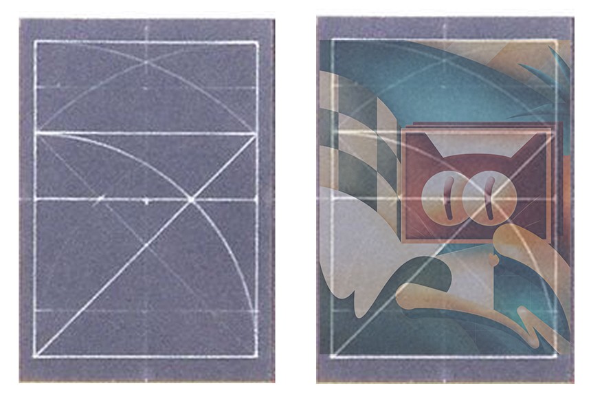
I used a grid that I really liked because it allowed me to build an asymmetrical but balanced composition.
From the beginning, I knew the focal point would be the cat’s eyes —they feel hypnotic to me, and I wanted that feeling to come through in the poster.
I placed the eyes right where the main lines of the grid converge, and arranged the rest of the shapes to follow that flow.
The diagonals act as visual guides, leading the viewer’s gaze around the image but always bringing it back to the same place: the eyes.

Once I have the composition ready with the color blocks and main shapes, it’s time for my favorite part — bringing it to life.
This is where the magic starts. I begin to play with volumes, shadows, and light, trying to give everything more depth and make the piece start to breathe.

This is the final result.
I don’t have this print available yet, but you can discover more pieces and limited editions in my online store.
